Mapping Google's Location History in Python
If you have an Android phone, Google is tracking your location. If you have "Location History" turned on in your settings, Google is really tracking your location. If you have this setting turned off, Google will still record your location when an app that has proper permission (like Google Maps or Strava) requests your location. This is creepy and probably bad from a privacy standpoint, but it's cool and fun from a data and visualisation standpoint. In the interest of blog content, I've let google track my location since I got my new phone ~1.5 years ago and it's now time to look at the data.
Google offers ways to look at your location history through their apps, but it's more fun to do it myself. Through myaccount.google.com, you can create an archive of your personal information being stored by Google. You can pick which services you're interested in, but for now I'm just looking for my location history data. It takes some time for Google to create the archive and make it available for download.
Loading the location data
You location history is stored as a JSON file, so I used the Pandas json tools to convert the file into an dataframe.
%matplotlib notebook
import pandas as pd
import numpy as np
import json
from pandas.io.json import json_normalize
with open('Location_History.json') as f:
    data = json.loads(f.read())

df = json_normalize(data['locations'])
df.head()
Looks good, but some things need to be cleaned up. I need to pull the time value out of the "activity" column and convert it from unix time to a date, and convert latitude and longitude to degrees. I also notice that there's some timepoints with lat and long both zero, so I'll drop those rows.
df['timems'] = df['activity'].map(lambda x: x[0]['timestampMs'],na_action='ignore')
df['time'] = pd.to_datetime(df['timems'], unit='ms')


df['latitude'] = df['latitudeE7'].map(lambda x:x/10000000)
df['longitude'] = df['longitudeE7'].map(lambda x:x/10000000)

df = df[df.latitude != 0]

df = df.set_index('time')
df.head()
Plotting with Cartopy
Cartopy brings GIS functionality with Python and Matplotlib. It's pretty easy to play around with. There's various ways to visualize location data with cartopy. In this example, I'll use image tiles and plot my location on top of them. I also played around with using shapefiles to plot regional boundaries and roads instead of using map tiles, but I found that for the range of locations I wanted to use that was getting too complicated. If I was just mapping in Vancouver, for example, I would probably use local shapefiles for a nice clean map. In this case, the only external shapefile that I'll use is the Natural Earth file of populated places, which gives us coordinates and population (and other information) for cities around the world.
For easy plotting, I'll write a function that takes as input our dataframe, a date we're interested, and the list of Natural Earth populated places. The function will compute the geographical area we need to plot for that day, the cities we need to plot in that area, and plot the cities and location points. It will then return a matplotlib figure that we can display or save.
import cartopy.crs as ccrs
import cartopy.feature as cfeature
import cartopy.io.shapereader as shpreader
import cartopy.io.img_tiles as cimgt
pprecords = list(shpreader.Reader('/Users/msj/Dropbox/urban/maps/ne_10m_populated_places.shp').records())
ppshapes = list(shpreader.Reader('/Users/msj/Dropbox/urban/maps/ne_10m_populated_places.shp').geometries())
# zip the shapes and records together, sorted by population
ppdata = sorted(list(zip(pprecords,ppshapes)),key=lambda x: x[0].attributes['POP2015'],reverse=True)
def make_map(df,day=None,ppdata=None,extent=None):

    # Get latitudes and longitudes from dataframe
    longs = df.loc[day,'longitude'].values
    lats = df.loc[day,'latitude'].values


    # Create a Stamen Terrain instance.
    stamen_terrain = cimgt.StamenTerrain()

    # Create a GeoAxes in the tile's projection.
    f,ax = plt.subplots(figsize=(10,10))
    ax = plt.axes(projection=stamen_terrain.crs)

    # Limit the extent of the map to a suitable longitude/latitude
    # range for the given day.
    xr = longs.min(),longs.max(),abs(longs.max()-longs.min())
    yr = lats.min(),lats.max(),abs(lats.max()-lats.min())
    r = max(xr,yr,key=lambda x:x[2])
    r = max((r[2]/2)*1.1 , 0.1)
    xm = (longs.max()+longs.min())/2
    ym = (lats.max()+lats.min())/2


    if extent is None:
        ax.set_extent([xm-r, xm+r, ym-r, ym+r])
    else:
        ax.set_extent(extent)


    # Add the Stamen data
    if r>5: zoom=5
    else: zoom=11
    ax.add_image(stamen_terrain, zoom)


    # Plot route
    ax.plot(longs,lats,color='#1a9c99',transform=ccrs.Geodetic(),alpha=0.7,linewidth=1)
    ax.scatter(longs,lats,color='red',transform=ccrs.Geodetic(),s=1.5)


    # Plot cities
    if ppdata is not None:

        # Filter to cities in range we're plotting
        ppdata = [x for x in ppdata if (xm-r<x[1].coords[0][0]<xm+r) and (ym-r<x[1].coords[0][1]<ym+r)]

        # Take only top 10 most populated cities in range
        ppdata = ppdata[:10]


        if len(ppdata)>0:
            ppxy = [pt[1].coords[0] for pt in ppdata]
            ppx,ppy = zip(*ppxy)
            ppnames = [x[0].attributes['NAME'] for x in ppdata]
            ax.scatter(ppx,ppy,color='#ffa263',transform=ccrs.Geodetic())
            for i,s in enumerate(ppnames):
                ax.text(ppx[i],ppy[i],ppnames[i],
                        transform=ccrs.Geodetic(),
                        clip_on=True)


    # Add the date to the bottom corner of the figure
    ax.text(0.1,0.1,day,transform=ax.transAxes,bbox={'facecolor':'white','pad':5})


    return f,ax
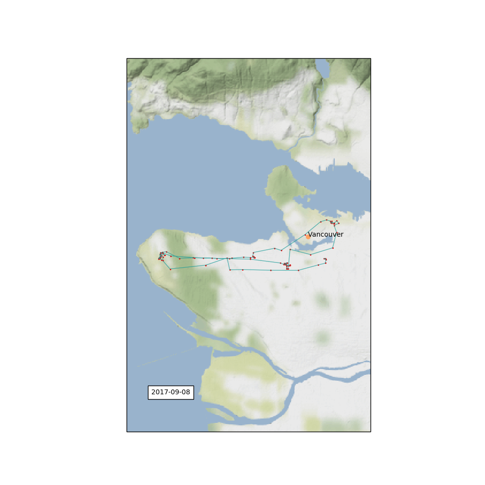
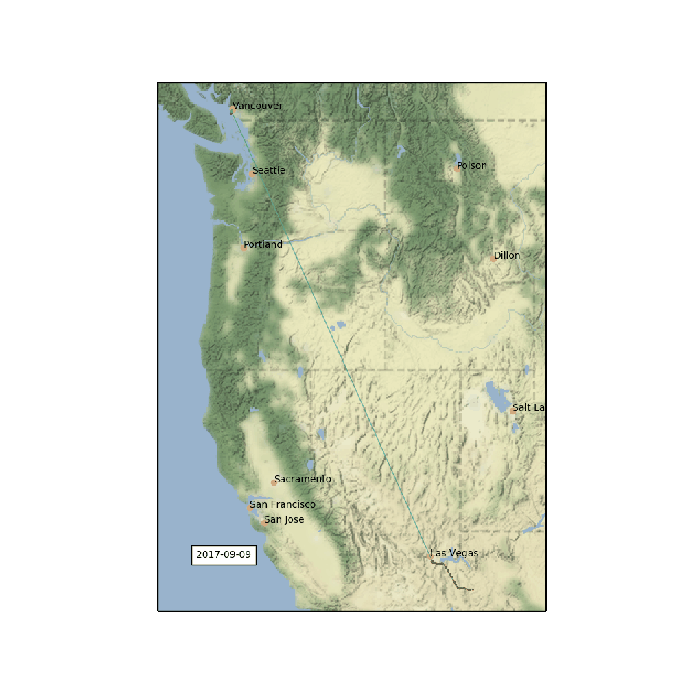
Now I can plot my location history for a given day. On this day, I was running all over the city getting ready for our trip to the US Southwest.
f,ax = make_map(df,'2017-09-08',ppdata)
I want an image for each day, so I'll automate this by making a list of days in the dataframe and then looping over the days and making and saving a map for each day.
days = sorted(list(set(df.index.dropna().strftime('%Y-%m-%d'))),reverse=True)
plt.ioff()
while len(days)>0:
    day = days.pop()
    f,ax = make_map(df,day,ppdata)
    f.savefig('images/{}.png'.format(day))
    plt.close(f)


plt.ion()
(This can take a while if you have a lot of days to process -- cartopy will need to download the necessary image tiles for each day)
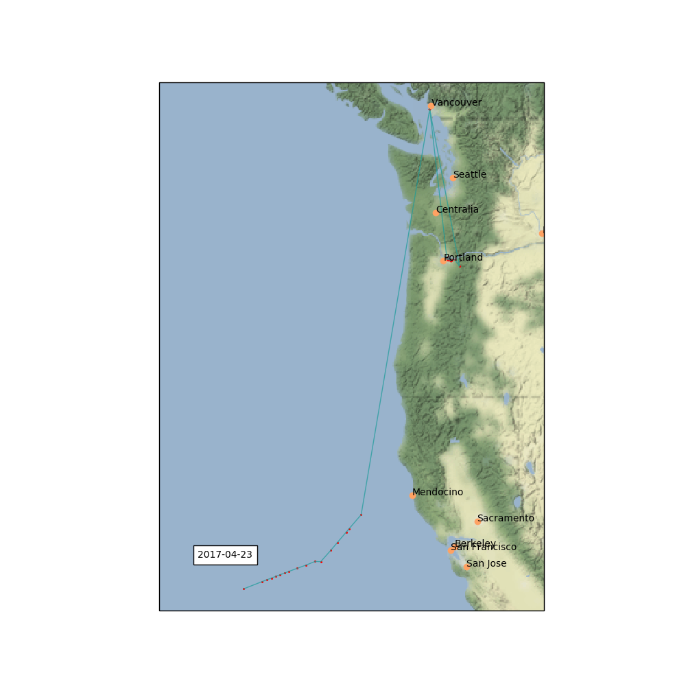
I found I needed to clean up a couple maps, where Google thought I was 1000s of kilometers away from where I actually was. This is easy enough to do by filtering the dataframe before passing it to the function. This seems to happen on days when I'm flying, I think connecting to airport wifi networks confuses Google.
day = '2017-04-23'
f,ax = make_map(df[df['longitude']<-100],day,ppdata)
f.savefig('images/{}.png'.format(day))
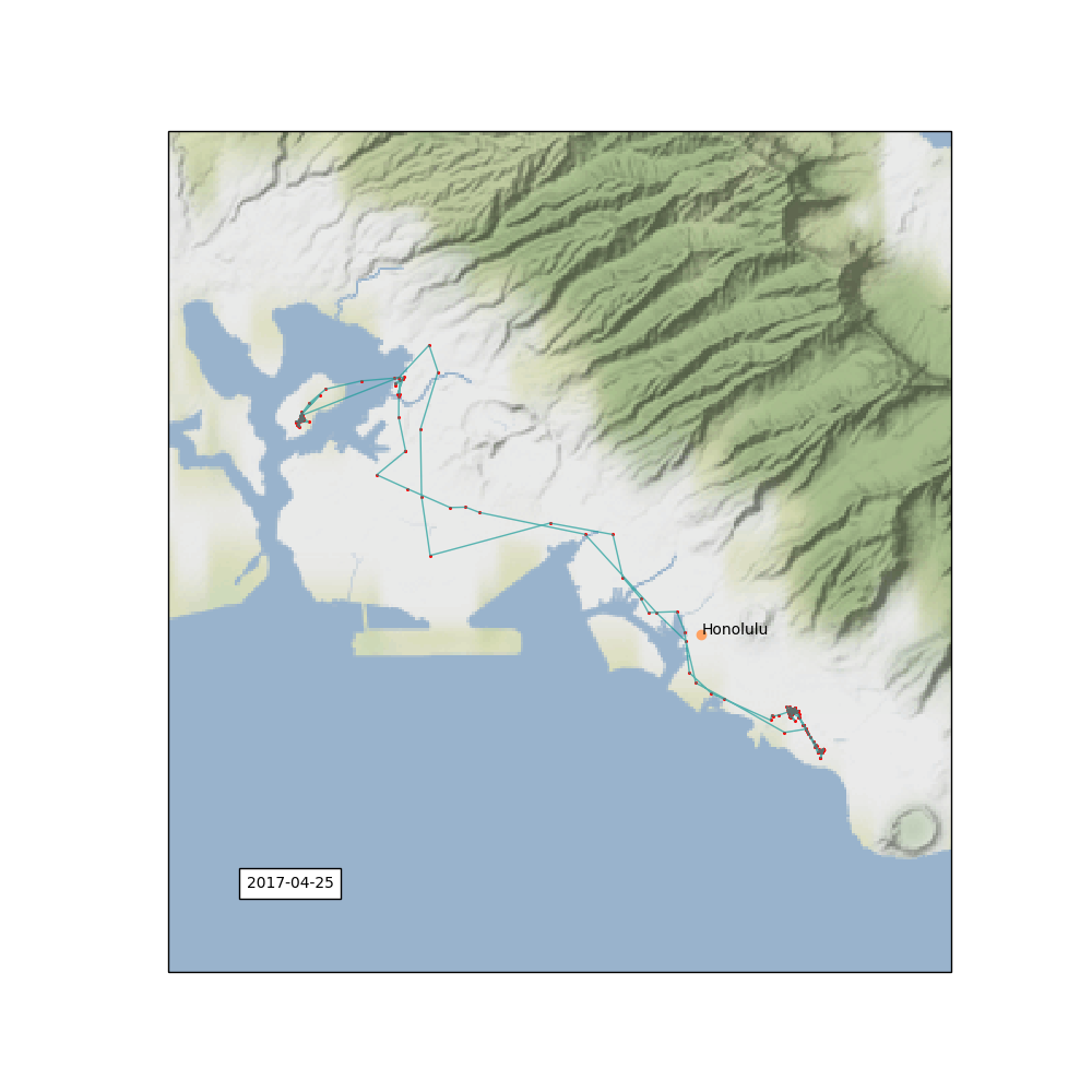
day = '2017-04-25'
f,ax = make_map(df[df['longitude']<0],day,ppdata)
f.savefig('images/{}.png'.format(day))
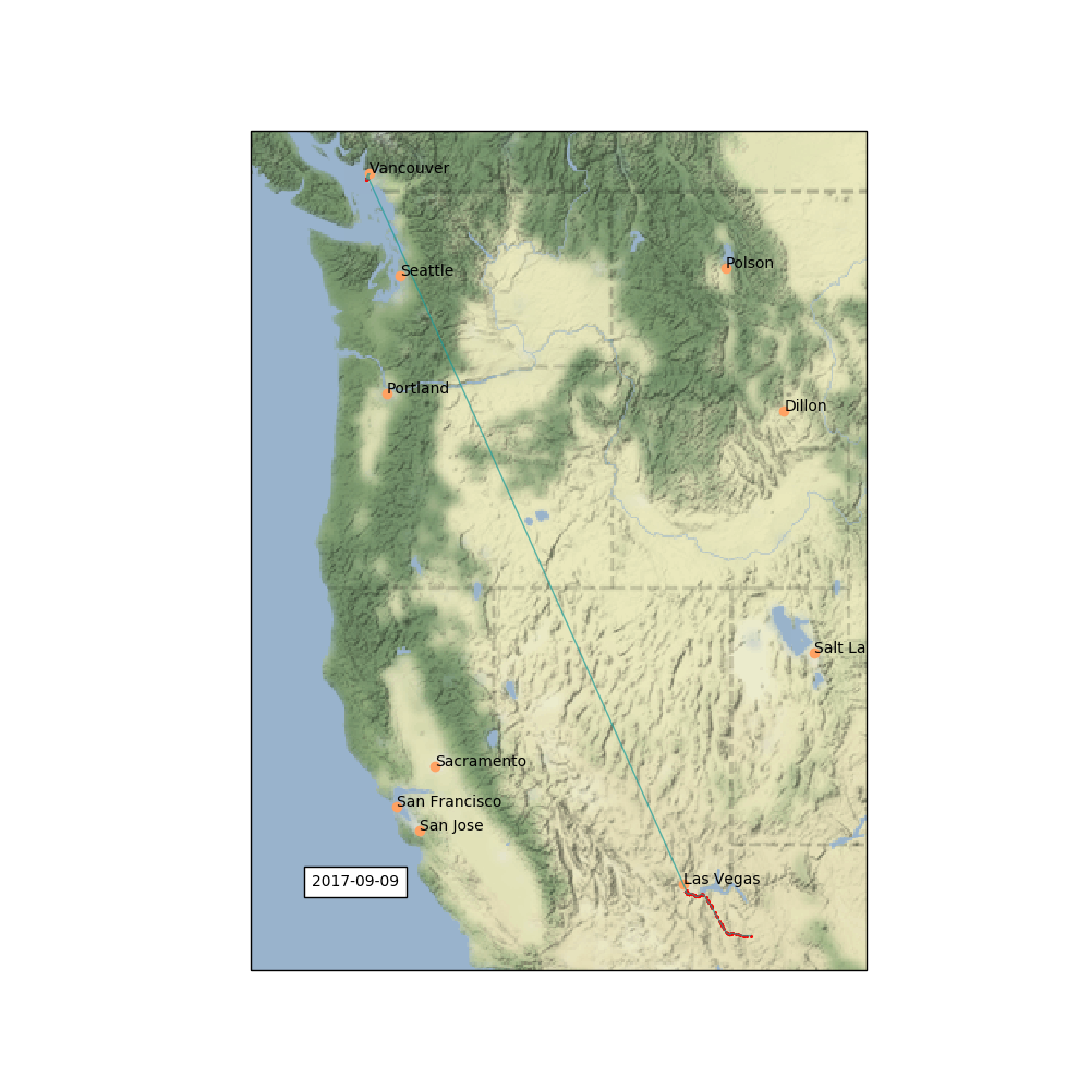
day = '2017-09-09'
f,ax = make_map(df[df['longitude']<-100],day,ppdata)
f.savefig('images/{}.png'.format(day))
Make animated GIFs from images
There's two straightforward ways to make animated GIFs in Python. First, I could create an animation with Matplotlib and save the animation as a GIF. Second, I can load static images with imagio and combine them. Since I've already made the static images, I'll take the second route.
Here I write a function that takes a list of filenames, the duration we want for each image, and the output file name, and creates a GIF out of those images
import imageio
def create_gif(filenames, duration, outname):
    images = []
    for filename in filenames:
        images.append(imageio.imread(filename))
    output_file = outname
    imageio.mimsave(output_file, images, format='GIF', duration=duration)
First I'll make a GIF of the entire location history, with each image lasting 1 second.
files = sorted(glob('images/*.png'))
create_gif(files,1,'images/google-location-history.gif')
I can now also just take date ranges and make GIFs of specific trips.
# US Southwest

start = files.index('images/2017-09-09.png')
finish = files.index('images/2017-09-24.png')
create_gif(files[start:finish-1], 3,'images/southwest.gif' )
# Hawaii
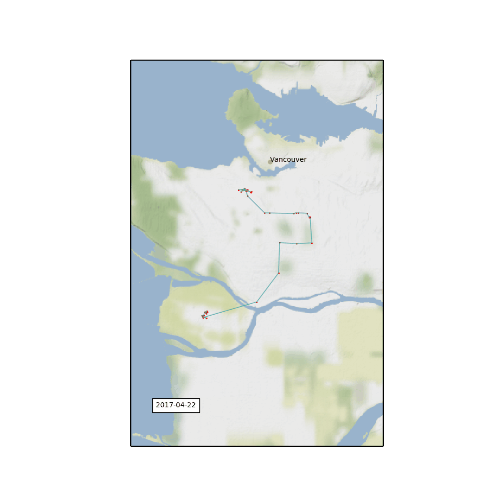
start = files.index('images/2017-04-22.png')
finish = files.index('images/2017-05-03.png')
create_gif(files[start:finish-1], 3,'images/hawaii.gif' )
# Christmas 2017

start = files.index('images/2017-12-22.png')
finish = files.index('images/2018-01-01.png')
create_gif(files[start:finish-1], 3,'images/christmas.gif' )
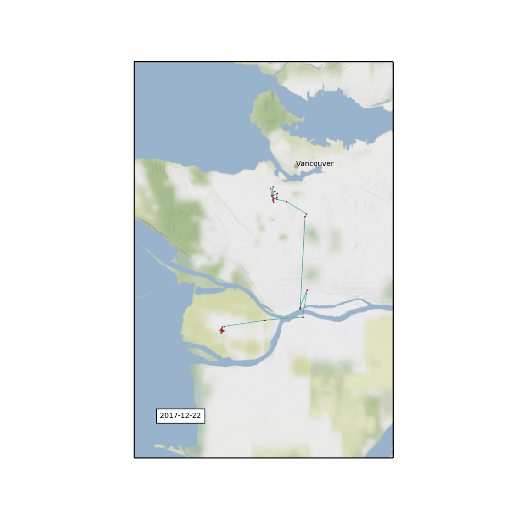
You can even see the two days over the Christams holidays where my phone was lost in a snow bank! And the time my flight was diverted on the way to Hawaii and I had to spend a night in Portland.
The main challenge in making GIFs out of cartographic renderings is that it's tough to get a consistent aspect ratio. In my function, each map has an equal latitude and longitude range in degrees, but depending on the projection you're mapping in this will change the resulting aspect ratio of your image depending on the latitude at which you're plotting. I dealt with this be specifying a square figure size in my initial pyplot call, otherwise some of the images might get cut off when you combine them as a GIF.
Comments
Comments powered by Disqus