Machine learning with Vancouver bike share data
Six months ago I came across Jake VanderPlas' blog post examining Seattle bike commuting habits through bike trip data. I wanted to try to recreate it for Vancouver, but the city doesn't publish detailed bike trip data, just monthly numbers. For plan B, I looked into Mobi bike share data. But still no published data! Luckily, Mobi does publish an API with the number of bike at each station. It doesn't give trip information, but it's a start. All the code needed to recreate this post is available on my github page.
Data Acquisition
The first problem was to read the API and take a guess at station activity. To do this, I query the API every minute. Whenever the bike count at a station changes, this is counted as bikes being taken out or returned. I don't know exactly how often Mobi updates this API, but I'm certainly undercounting activity -- whenever two people return a bike and take a bike within a minute or so of each other I'll miss the activity. But it's good enough for my purposes, and I'm more interested in trends than total numbers anyway. I had two main problems querying the API: First, I'd starting by running the query script on my home machine. This meant that any computer downtime meant missing data. There's a few days missing while I updated my computer. Eventually I migrated to a google cloud server, so downtime is no longer an issue, but this introduced the second problem: time zones. I hadn't set a time zone for my new server, so all the times were recorded as UTC, while earlier data had been recorded in local Vancouver time. It took a long time of staring at the data wondering why it didn't make sense for me to realize what had happened, but luckily an easy fix in Pandas.Analysis
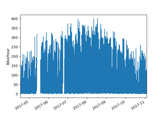 Our long stretch of good weather this summer is visible in the data. Usage was pretty consistent over July and August, and began to fall off near the end of September when the weather turned. I'll be looking more into the relationship between weather and bike usage once I have more off-season data, but for now I'm more interested in zooming in and looking at daily usage patterns. Looking at a typical week in mid summer, we see weekdays showing a typical commuter pattern with morning and evening peaks and a midday lull. One thing that jumps out is the afternoon peak being consistently larger than the morning peak. With bike share, people have the option to take the bus to work in the morning and then pick up a bike afterwork if they're in the mood. Weekends lose that bimodal distribution and show a single normal distribution centered in the afternoon. On most weekend days and some weekdays, there is a shoulder or very minor peak visible in the late evening, presumably people heading home from a night out.
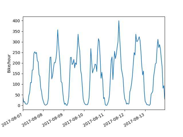
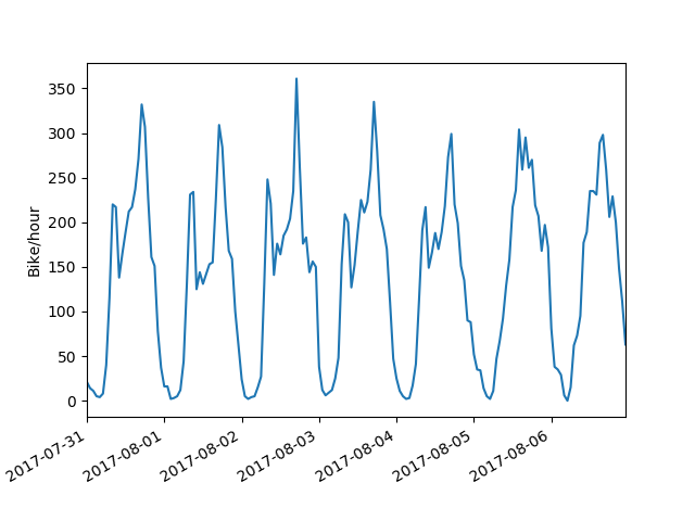 Looking at the next week, Monday immediately jumps out as showing a weekend pattern instead of a weekday. That Monday, of course, is the Monday of the August long weekend.
 So, by eye we can fairly easily distinguish weekday and weekend travel patterns. How can we train a computer to do the same?
First, I pivoted my data such that each row is a day, and each column is the hourly bike activity at each station (# columns = # stations * 24). I decided to keep the station information instead of summing across stations, but both give about the same result. This was provided as input to the primary component analysis (PCA) class of the Scikit-Learn Python package. PCA attempts to reduce the dimensionality of a data set (in our case, columns) while preserving the variance. For visualization, we can plot our data based on the the two components which most explain the variance in the data. Each point is a single day, colour labelled by total number of trips that day.
So, by eye we can fairly easily distinguish weekday and weekend travel patterns. How can we train a computer to do the same?
First, I pivoted my data such that each row is a day, and each column is the hourly bike activity at each station (# columns = # stations * 24). I decided to keep the station information instead of summing across stations, but both give about the same result. This was provided as input to the primary component analysis (PCA) class of the Scikit-Learn Python package. PCA attempts to reduce the dimensionality of a data set (in our case, columns) while preserving the variance. For visualization, we can plot our data based on the the two components which most explain the variance in the data. Each point is a single day, colour labelled by total number of trips that day.
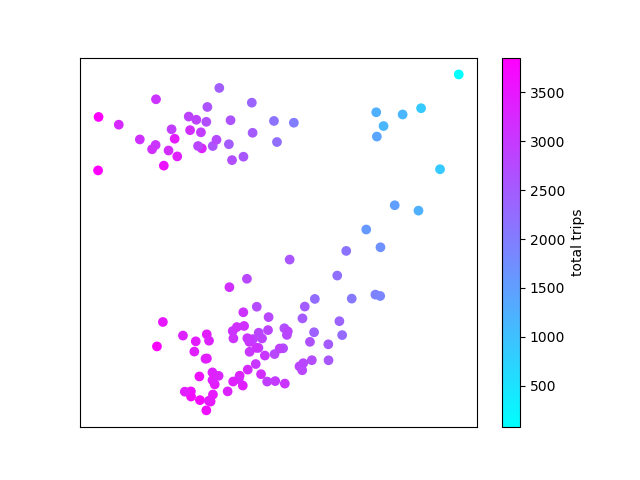 PCA coloured by number of daily trips
It's apparent that the first component (along the X axis) corresponds roughly (but not exactly) to total number of trips. But what does the Y axis represent? To investigate further, we label the data points by day of week.
PCA coloured by number of daily trips
It's apparent that the first component (along the X axis) corresponds roughly (but not exactly) to total number of trips. But what does the Y axis represent? To investigate further, we label the data points by day of week.
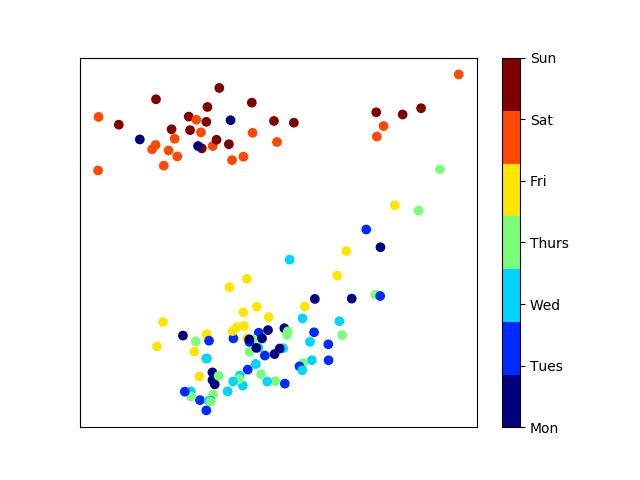 PCA coloured by day of week
The pattern is immediately clear. Weekdays are clustered at the bottom of our plot, and weekends are clustered at the top. A few outliers jump out. There are 3 Mondays clustered in with the weekend group. These turn out to be the Canada Day, BC Day and Labour Day stat holidays.
PCA coloured by day of week
The pattern is immediately clear. Weekdays are clustered at the bottom of our plot, and weekends are clustered at the top. A few outliers jump out. There are 3 Mondays clustered in with the weekend group. These turn out to be the Canada Day, BC Day and Labour Day stat holidays.
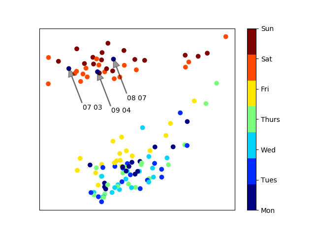 PCA with noteable Mondays labelled
Finally, I wanted to try unsupervised clustering to see if weekday and weekend clusters are separated enough to be distinguished automatically. For this, I used the GaussianMixture class from Scikit-learn. Here, we try to automatically split our data into a given number of groups, in this case two.
PCA with noteable Mondays labelled
Finally, I wanted to try unsupervised clustering to see if weekday and weekend clusters are separated enough to be distinguished automatically. For this, I used the GaussianMixture class from Scikit-learn. Here, we try to automatically split our data into a given number of groups, in this case two.
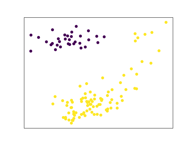 PCA and unsupervised clustering of June-September bike share usage
Not quite. There is a group of low-volume weekend days in the top right cornerthat can't be automatically distinguished from weekdays. All these days are in June and September. Maybe with more non-summer data this will resolve itself.
Out of curiosity, I re-ran the PCA and unsupervised clustering with only peak season data (July and August). Here, with more a more homogenous dataset, clustering works much better. In fact, only the first component (plotted along the X axis) is needed to distinguish between usage patterns.
PCA and unsupervised clustering of June-September bike share usage
Not quite. There is a group of low-volume weekend days in the top right cornerthat can't be automatically distinguished from weekdays. All these days are in June and September. Maybe with more non-summer data this will resolve itself.
Out of curiosity, I re-ran the PCA and unsupervised clustering with only peak season data (July and August). Here, with more a more homogenous dataset, clustering works much better. In fact, only the first component (plotted along the X axis) is needed to distinguish between usage patterns.
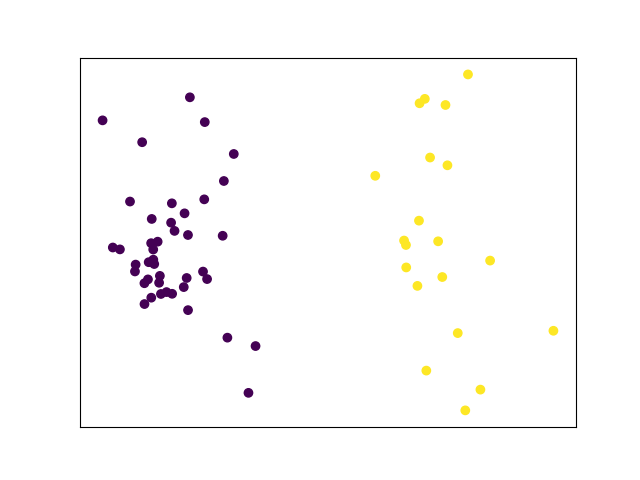 PCA and unsupervised clustering of July and August bike share usage
Bike share usage will obviously decline during Vancouver's wet season, but I'm very interested to see how usage patterns will differ during the lower volume months.
All the source code used for data acquisition and analysis in this post is available on my github page.
To see more posts like this, follow me on twitter @MikeJarrett_.
PCA and unsupervised clustering of July and August bike share usage
Bike share usage will obviously decline during Vancouver's wet season, but I'm very interested to see how usage patterns will differ during the lower volume months.
All the source code used for data acquisition and analysis in this post is available on my github page.
To see more posts like this, follow me on twitter @MikeJarrett_.
Comments
Comments powered by Disqus