Mobi station activity
I finally got around to learning how to map data on to maps with Cartopy, so here's some quick maps of Mobi bikeshare station activity.
First, an animation of station activity during a random summer day. The red-blue spectrum represents whether more bikes were taken or returned at a given station, and the brightness represents total station activity during each hour. I could take the time resolution lower than an hour, but I doubt the data is very meaningful at that level.
[video width="704" height="528" mp4="/images/movie_2017-08-18.mp4"][/video]
There's actually less pattern to this than I expected. I thought that in the morning you'd see more bikes being taken from the west end and south False Creek and returned downtown, and vice versa in the afternoon. But I can't really make out that pattern visually.
I've also pulled out total station activity during the time I've been collecting this data, June through October 2017. I've separated it by total bikes taken and total bikes returned. A couple things to note about these images: many of these stations were not active for the whole time period, and some stations have been moved around. I've made no effort to account for this; this is simply the raw usage at each location, so the downtown

 The similarity in these maps is striking. Checking the raw data, I'm seeing incredibly similar numbers of bikes being taken and returned at each station. This either means that on aggregate people use Mobis for two way trips much more often than I expected; one way trips are cancelling each other out; or Mobi is rebalancing the stations to a degree that any unevenness is being masked out*. I hope to look more into whether I can spot artificial station balancing from my data soon, but we may have to wait for official data from Mobi to get around this.
*There's also the possibility that my data is bad, but let's ignore that for now
Instead of just looking at activity, I tried to quantify whether there are different activity patterns at different stations. Like last week, I performed a primary component analysis (PCA) but with bike activity each hour in the columns, and each station as a row. I then plot the top two components which most explain the variance in the data.
The similarity in these maps is striking. Checking the raw data, I'm seeing incredibly similar numbers of bikes being taken and returned at each station. This either means that on aggregate people use Mobis for two way trips much more often than I expected; one way trips are cancelling each other out; or Mobi is rebalancing the stations to a degree that any unevenness is being masked out*. I hope to look more into whether I can spot artificial station balancing from my data soon, but we may have to wait for official data from Mobi to get around this.
*There's also the possibility that my data is bad, but let's ignore that for now
Instead of just looking at activity, I tried to quantify whether there are different activity patterns at different stations. Like last week, I performed a primary component analysis (PCA) but with bike activity each hour in the columns, and each station as a row. I then plot the top two components which most explain the variance in the data.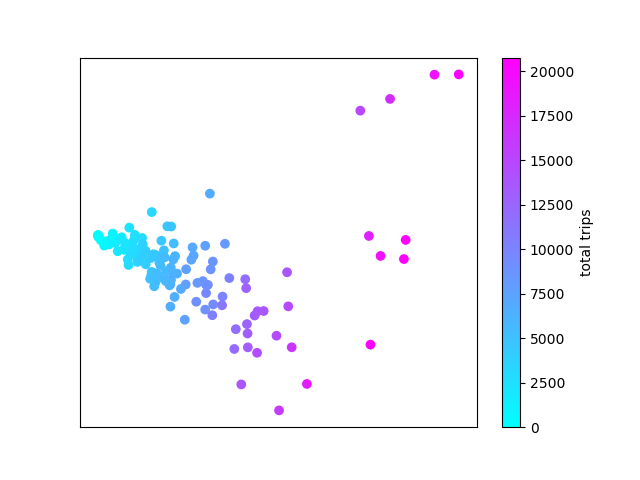 Like last week, much of the difference in station activity is explained by the total number of trips at each station, here represented on the X axis. There is a single main group of stations with a negative slope, but some outliers that are worth looking at. There are a few stations with higher Y values than expected.
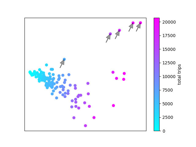 These 5 stations are all Stanley Park stations. There's another four stations that might be slight outliers.
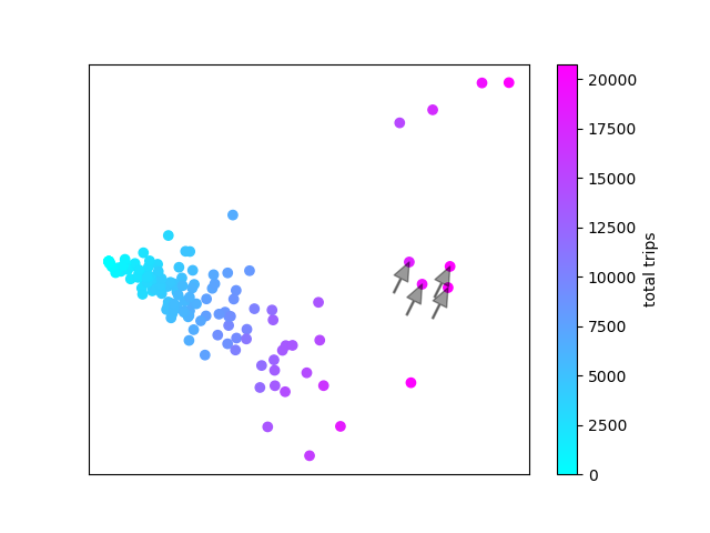 These are Anderson & 2nd (Granville Island); Aquatic Centre; Coal Harbour Community Centre; and Davie & Beach. All seawall stations at major destinations. So all the outlier stations are stations that we wouldn't expect to show regular commuter patterns, but more tourist-style activity.
I was hoping to see different clusters to represent residential area stations vs employment area stations, but these don't show up. Not terribly surprising since the Mobi stations cover an area of the city where there is fairly dense residential development almost everywhere. This fits with our maps of station activity, where we saw that there were no major difference between bikes taken and bikes returned at each station.
All the source code used for data acquisition and analysis in this post is available on my github page.
To see more posts like this, follow me on twitter @mikejarrett_.
These are Anderson & 2nd (Granville Island); Aquatic Centre; Coal Harbour Community Centre; and Davie & Beach. All seawall stations at major destinations. So all the outlier stations are stations that we wouldn't expect to show regular commuter patterns, but more tourist-style activity.
I was hoping to see different clusters to represent residential area stations vs employment area stations, but these don't show up. Not terribly surprising since the Mobi stations cover an area of the city where there is fairly dense residential development almost everywhere. This fits with our maps of station activity, where we saw that there were no major difference between bikes taken and bikes returned at each station.
All the source code used for data acquisition and analysis in this post is available on my github page.
To see more posts like this, follow me on twitter @mikejarrett_.
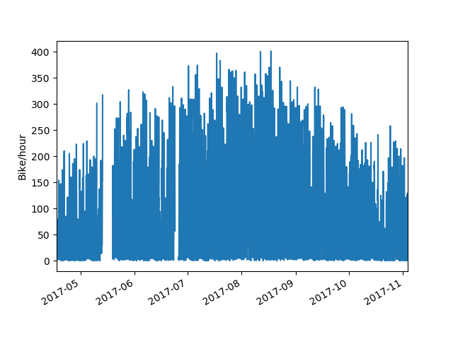 Our long stretch of good weather this summer is visible in the data. Usage was pretty consistent over July and August, and began to fall off near the end of September when the weather turned. I'll be looking more into the relationship between weather and bike usage once I have more off-season data, but for now I'm more interested in zooming in and looking at daily usage patterns. Looking at a typical week in mid summer, we see weekdays showing a typical commuter pattern with morning and evening peaks and a midday lull. One thing that jumps out is the afternoon peak being consistently larger than the morning peak. With bike share, people have the option to take the bus to work in the morning and then pick up a bike afterwork if they're in the mood. Weekends lose that bimodal distribution and show a single normal distribution centered in the afternoon. On most weekend days and some weekdays, there is a shoulder or very minor peak visible in the late evening, presumably people heading home from a night out.
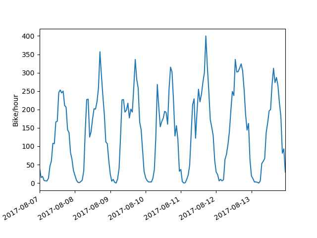
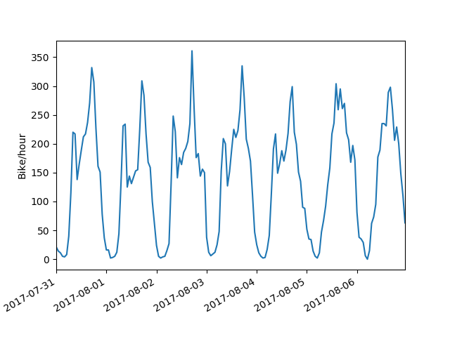 Looking at the next week, Monday immediately jumps out as showing a weekend pattern instead of a weekday. That Monday, of course, is the Monday of the August long weekend.
 So, by eye we can fairly easily distinguish weekday and weekend travel patterns. How can we train a computer to do the same?
First, I pivoted my data such that each row is a day, and each column is the hourly bike activity at each station (# columns = # stations * 24). I decided to keep the station information instead of summing across stations, but both give about the same result. This was provided as input to the
So, by eye we can fairly easily distinguish weekday and weekend travel patterns. How can we train a computer to do the same?
First, I pivoted my data such that each row is a day, and each column is the hourly bike activity at each station (# columns = # stations * 24). I decided to keep the station information instead of summing across stations, but both give about the same result. This was provided as input to the 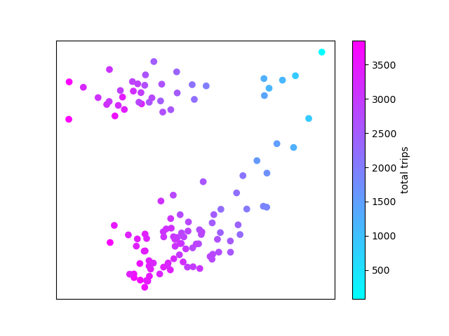 PCA coloured by number of daily trips
It's apparent that the first component (along the X axis) corresponds roughly (but not exactly) to total number of trips. But what does the Y axis represent? To investigate further, we label the data points by day of week.
PCA coloured by number of daily trips
It's apparent that the first component (along the X axis) corresponds roughly (but not exactly) to total number of trips. But what does the Y axis represent? To investigate further, we label the data points by day of week.
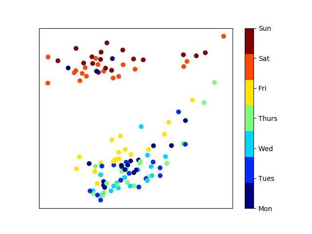 PCA coloured by day of week
The pattern is immediately clear. Weekdays are clustered at the bottom of our plot, and weekends are clustered at the top. A few outliers jump out. There are 3 Mondays clustered in with the weekend group. These turn out to be the Canada Day, BC Day and Labour Day stat holidays.
PCA coloured by day of week
The pattern is immediately clear. Weekdays are clustered at the bottom of our plot, and weekends are clustered at the top. A few outliers jump out. There are 3 Mondays clustered in with the weekend group. These turn out to be the Canada Day, BC Day and Labour Day stat holidays.
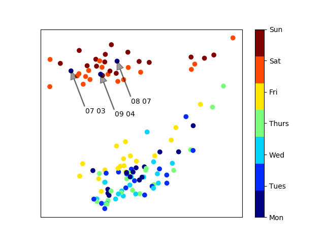 PCA with noteable Mondays labelled
Finally, I wanted to try unsupervised clustering to see if weekday and weekend clusters are separated enough to be distinguished automatically. For this, I used the
PCA with noteable Mondays labelled
Finally, I wanted to try unsupervised clustering to see if weekday and weekend clusters are separated enough to be distinguished automatically. For this, I used the 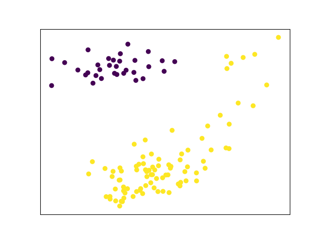 PCA and unsupervised clustering of June-September bike share usage
Not quite. There is a group of low-volume weekend days in the top right cornerthat can't be automatically distinguished from weekdays. All these days are in June and September. Maybe with more non-summer data this will resolve itself.
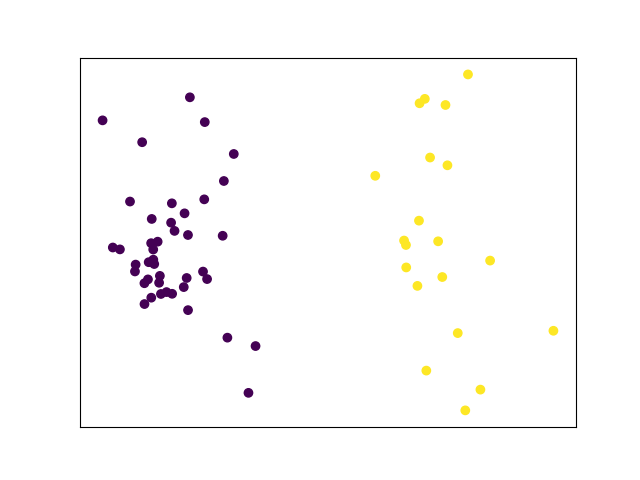
Out of curiosity, I re-ran the PCA and unsupervised clustering with only peak season data (July and August). Here, with more a more homogenous dataset, clustering works much better. In fact, only the first component (plotted along the X axis) is needed to distinguish between usage patterns.
PCA and unsupervised clustering of June-September bike share usage
Not quite. There is a group of low-volume weekend days in the top right cornerthat can't be automatically distinguished from weekdays. All these days are in June and September. Maybe with more non-summer data this will resolve itself.
Out of curiosity, I re-ran the PCA and unsupervised clustering with only peak season data (July and August). Here, with more a more homogenous dataset, clustering works much better. In fact, only the first component (plotted along the X axis) is needed to distinguish between usage patterns.
 PCA and unsupervised clustering of July and August bike share usage
Bike share usage will obviously decline during Vancouver's wet season, but I'm very interested to see how usage patterns will differ during the lower volume months.
All the source code used for data acquisition and analysis in this post is available on my
PCA and unsupervised clustering of July and August bike share usage
Bike share usage will obviously decline during Vancouver's wet season, but I'm very interested to see how usage patterns will differ during the lower volume months.
All the source code used for data acquisition and analysis in this post is available on my