Connecting neighbourhoods
I've been working on how best to look at connections between the various Mobi bikeshare stations throughout Vancouver. One thing the quickly became obvious was that some visualizations are much too noisy with all stations, but work nicely when I group stations into neighbourhoods. Luckily the city geometry files of the various neighourhoods available in their open data collection, so I was able to use those to group the stations according to the city's official definitions. See the distributions of stations below.
import mobi
import matplotlib as mpl
import matplotlib.pyplot as plt
import numpy as np

import cartopy.crs as ccrs
import cartopy.io.shapereader as shpreader
import shapely
import pyproj

%matplotlib notebook
sdf = mobi.get_stationsdf('/data/mobi/data/')
nhoods = sorted(set(sdf['neighbourhood']))
# Helper function to filter polygons in shapefiles
def shapes_with_atts(shapef,att,vals):
    shapes = list(shpreader.Reader(shapef).geometries())
    records = list(shpreader.Reader(shapef).records())
    shapes = [s for s,r in sorted(zip(shapes,records),key=lambda x:x[1].attributes[att]) if r.attributes[att] in vals]
    return shapes

# Prep colors. We need sdf.color to be integers (matched to hoods) so that matplotlib can use it with a colormap
color_list = plt.cm.tab20(range(11))
sdf['color'] = sdf.neighbourhood.map({n:c for n,c in zip(nhoods,range(11))})
plot = mobi.GeoPlot()
statlats = sdf.loc[sdf.active,'coordinates'].map(lambda x: x[1])
statlongs = sdf.loc[sdf.active,'coordinates'].map(lambda x: x[0])

shapef = '/home/msj/shapes/local_area_boundary.shp'
pshapef = '/home/msj/shapes/park_polygons.shp'
shapes = shapes_with_atts(shapef,'NAME',nhoods)

# Hack to add stanley park in alphabetical order with other neighbourhoods
shapes = shapes[:-2] + shapes_with_atts(pshapef,'PARK_NAME',['Stanley Park']) + shapes[-2:]
plot.ax.add_geometries(shapes, ccrs.epsg(26910),facecolor=color_list,edgecolor='k',alpha=0.6,zorder=1)


s = plot.ax.scatter(statlats,statlongs,transform=ccrs.PlateCarree(),
                    c=sdf.color,zorder=101,cmap=mpl.colors.ListedColormap(color_list))

plot.f.set_figwidth(7)

cb = plot.f.colorbar(s,fraction=0.35)
cb.set_ticks([(x+0.5)*0.9 for x in range(len(nhoods))])
cb.set_ticklabels(nhoods)

I've make Stanley Park it's own neighbourhood instead of grouping it in with the West End. There's also only one station each in South Cambie and Riley Park due to a couple of straggler stations south of 16th. The 16th and Heather station is immediately shouth of 16th so could easily be grouped with Fairview but rules are rules.
import holoviews as hv

from holoviews import opts,dim
from mobi_system_data import *

hv.extension('bokeh',logo=False)
hv.output(size=300)
df = prep_sys_df('/data/mobi/data/Mobi_System_Data.csv')
df = add_station_coords(df,sdf,bidirectional=False)

df = df.rename(columns={'Departure neighbourhood':'Departure_neighbourhood',
                       'Return neighbourhood':'Return_neighbourhood'})

links = df.groupby(['Departure_neighbourhood','Return_neighbourhood']).size().reset_index()
links = links.rename(columns={0:'trips'})
nodesdf = sdf[['neighbourhood']].drop_duplicates().copy()
nodesdf['name'] = nodesdf['neighbourhood']
nodesdf.loc[nodesdf['neighbourhood']=='Kensington-Cedar Cottage','name'] = "K-CC"
nodesdf.loc[nodesdf['neighbourhood']=='Grandview-Woodland','name'] = "G-W"
#nodesdf = nodesdf.set_index('name').sort_values('neighbourhood')
nodesdf = nodesdf.sort_values('neighbourhood')
nodes = hv.Dataset(nodesdf, 'neighbourhood','name')

import numpy as np
def rotate_label(plot, element):
    text_cds = plot.handles['text_1_source']
    length = len(text_cds.data['angle'])
    text_cds.data['angle'] = [0]*length
    xs = text_cds.data['x']
    text = np.array(text_cds.data['text'])
    xs[xs<0] -= np.array([len(t)*0.03 for t in text[xs<0]])

chord = hv.Chord((links, nodes), ['Departure_neighbourhood', 'Return_neighbourhood'], ['trips'])
chord = chord.opts(opts.Chord(
    cmap='tab20', labels='name',
    edge_color='Departure_neighbourhood',
    node_color='name',
    finalize_hooks=[rotate_label],
    label_text_font_size='12pt',
    label_text_color='#59656d',
    height=300,
    width=300#,
    #toolbar=None
))

# Uncomment below to generate the interactive bokeh plot
#chord
hv.save(chord,'neighbourhood-chord-large.png')
To illustrate connections between neighbourhood I'll use a chord plot, often used to illustrate migration patterns. All trip data from 2017 and 2018 is used to generate this. The least-connected neighbourhoods are given a single thread of connection, while more popular connections are given more of the circle's circumference. Trips that begin and end in the same neighbourhood are shown as threads starting and ending in the same section.
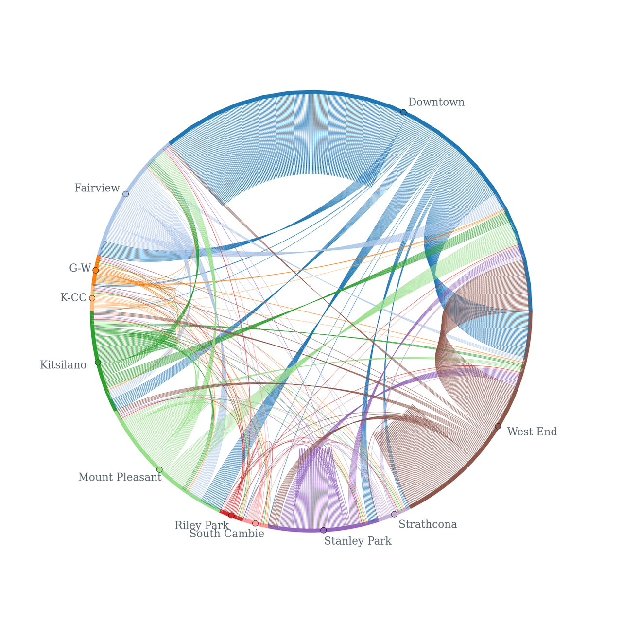
Do you see any interesting trends? The most intere
Comments
Comments powered by Disqus